Corporate Design
The famous red thread
To the overview
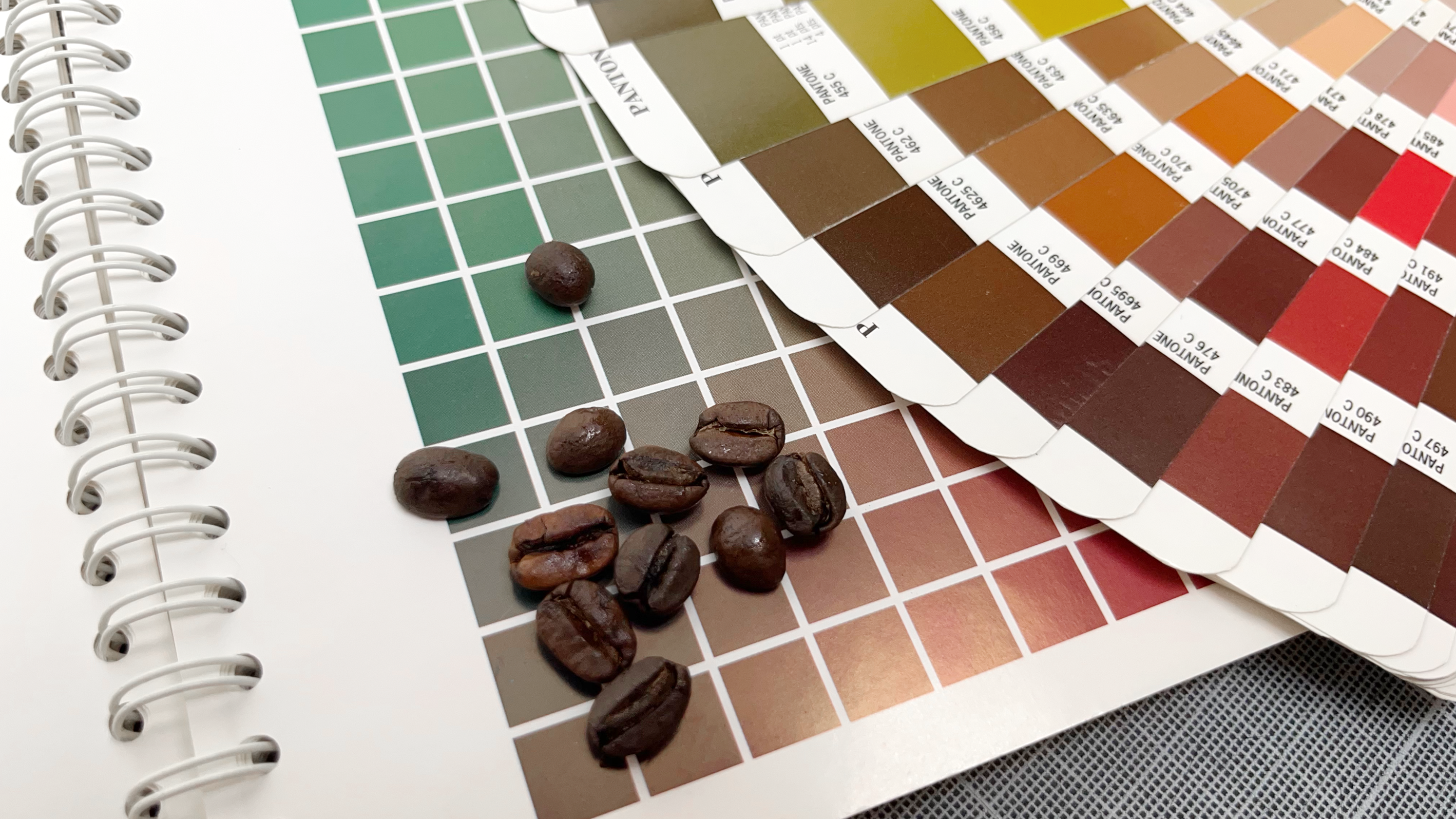
Colour choice
We associate colours with certain characteristics. Blue, for example, is associated with purity and hygiene, while red colours are associated with attention and love.
Colours therefore already convey certain emotions.
This can have a supporting effect on logos. This is why special attention must be paid to the choice of colour. We will be happy to help you choose the colours for your individual brand logo and select the right accent colours with you.

Font choice (typography)
Type not only conveys information - it is also a means of design.
Texts should be easy to read without tiring the eyes so that the reader does not turn away from the text. Distinctive fonts create an unmistakable corporate identity.
You can also "play" with individual letters.


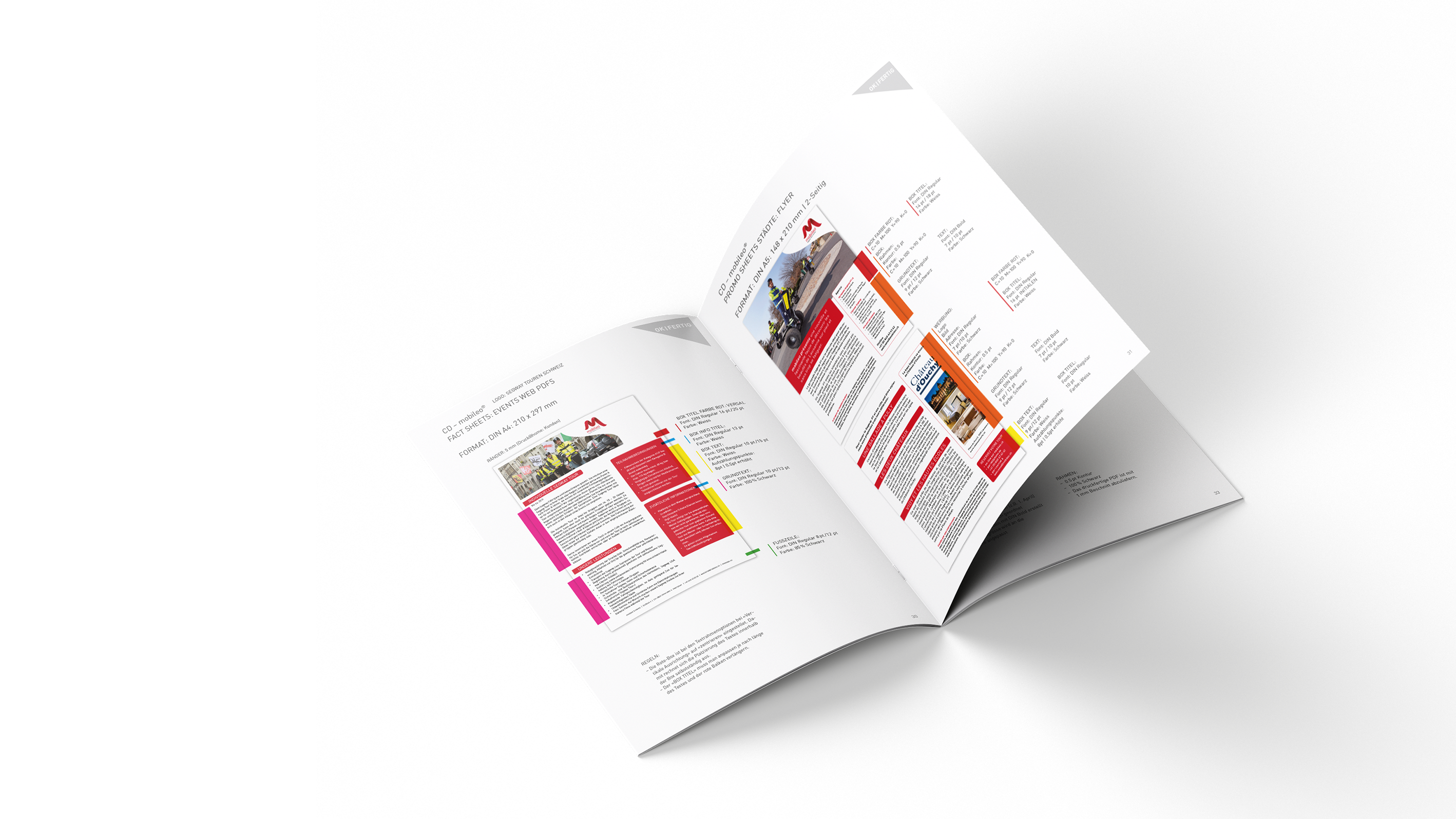
Room layout
A successful division of space makes a text easier to read and generates excitement and attention in the reader.
ProThe use of differentiated portions and the targeted use of white space enables the focussed presentation of content. The reader is directed to the relevant content and recognisable elements increase identification with the company.
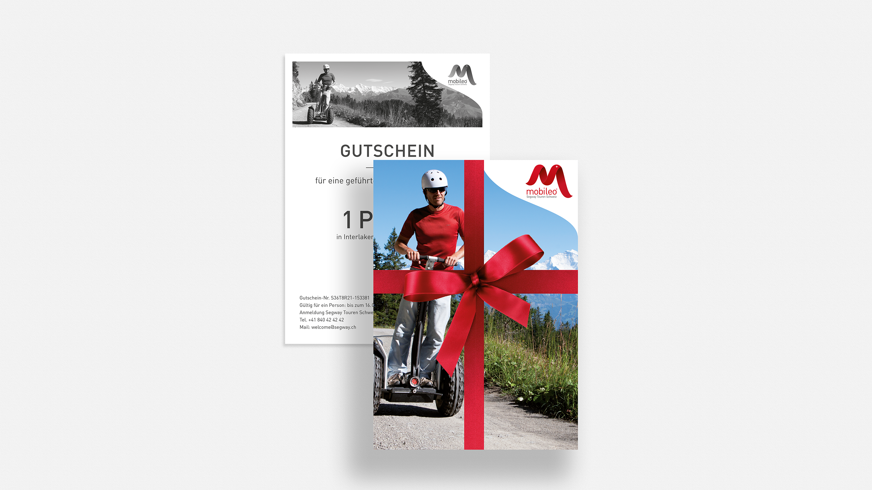

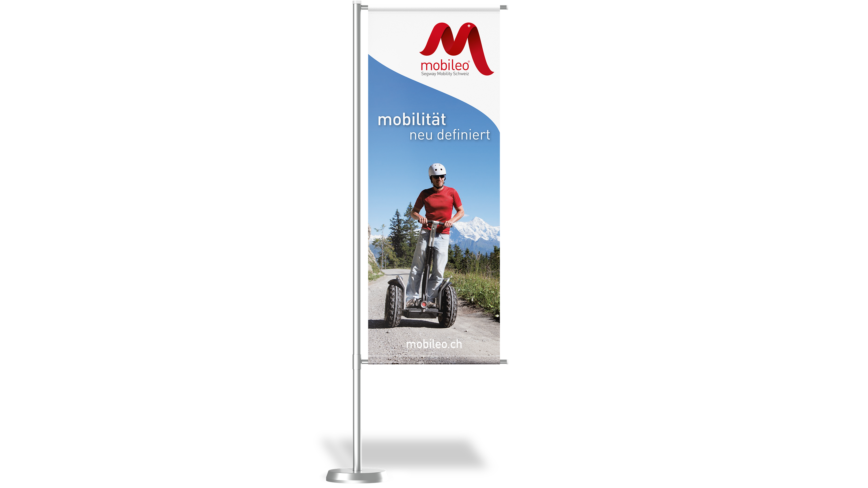
Corporate Design Manual
With unique branding, a brand can be recognised at first glance.
It makes sense to record the defined content in writing. This ensures that all advertising material has the same "look and feel" and therefore pursues the same goal as a unit: The clear and quick recognition of your brand.
The scope of a CD manual can range from a minimal scope to an all-encompassing reference work:
- Definition of colour and font
- Logo and proportions
- Technical and design specifications
- Samples
Do you have a question?
I will be happy to advise you on the most efficient advertising measures to achieve your goal. The best thing is to arrange a meeting right away.
Patric Kurth, Management & Concept